30 June 2012

Week 74 Lucky Dip and Guest Designer

June is one of our 5 week months, which means a special one for "Less is More"
and we are delighted to have Kim join us as our Guest Designer this week.
Many of you will know Kim as a regular to "Less is More" admired and gathered much inspiration from her.
Kim lives in Colarado, America. We are sure you wil lhave seen the horrendous fires happening in the state at the moment. We'd like to offer our thoughts for everyone's saftey at this time.

For our challenge we have decided to take our 
"Less is More"  
header as the inspiration for this challenge.

** Our blog header has a transparent panel behind the "Less is More" 
This one however, has a white background to make it better to copy into your blog posts should you wish **

We love to see how many different ways this could be interpreted.
You could simply do a CASE of it or use any of the elements as your theme... a decorated frame, the music, the flourishes, the flowers, the sentiment, the colours, the little jewels, there's really quite a lot of scope to let your imagination roam.
If your link is somewhat tenuous however, we would like you to explain just what your inspiration was.

Kim
...isn't it wonderful!


Chrissie
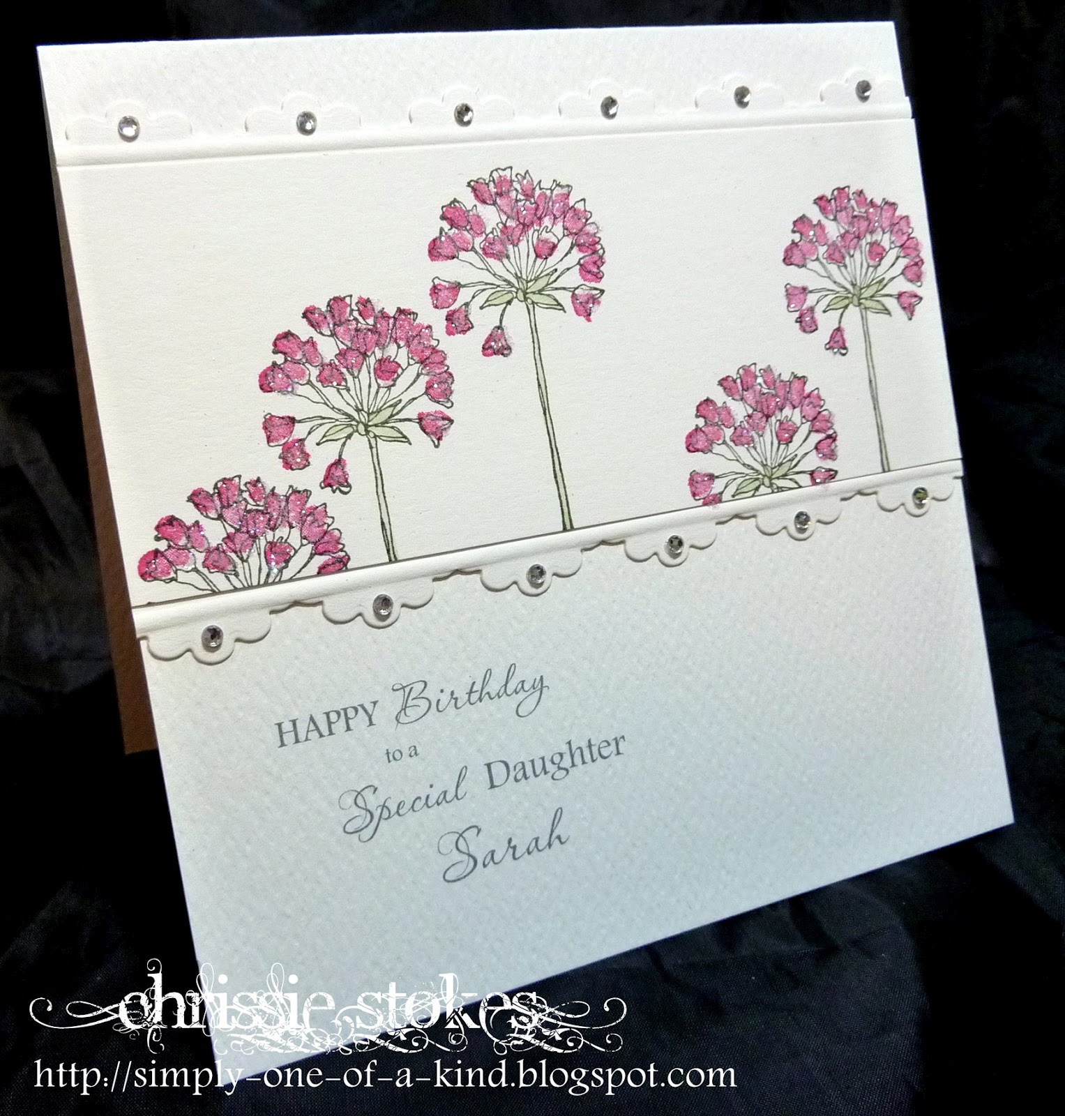
This is a straight case of our header. I used some Artemio music manuscript, a Kaisercraft collage stamp for the bottom part and a flourish whose origin is  a mystery to me. I spotted the Less is More stamp on a website and bought one for Mandi and myself as I couldn't resist them.
I began by stamping the sentiment and then popped a mask over it to add the other stamps.


For this one I took my inspiration from the music and the flourishes, plus the general colours. Once more it's the Artemio music stamp and some Indigo Blu flourishes (they are rather difficult to spot beneath the SU butterfly).
The other stamps are from Blockhead. The inks are SU Sahara Sand, Crumb Cake and Soft Suede applied with Ink Duster Brushes over a Post It mask across the bottom of the card. The sentiment is from Hero Arts.

Mandi

I was absolutely buzzing with ideas for this challenge, but, sadly my fingers weren't!! Nothing else would materialise. Isn't it strange when that happens! I have loads of part ideas nestled deep in my brain.....
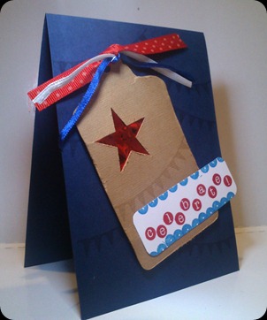
My Keep Calm sentiment was computer generated. Keep Calm sentiments are everywhere over in the UK.
I mounted it with 3d foam onto a square of brown card. The flourish, I have used all this week by Cheery Lynn. Roses, gem embellishment and punched leaves to finish.

We cannot wait to see what you creative lot come up with

More than ever before don't forget.......
"Less is More"

29 June 2012

ShowCASe Week 72 Something Shiny

You all loved our 'shiny' themed week. Not that you ever seem to complain anymore...
Are we getting too soft we wonder???

Here are our choices, all FANTASTIC
Thank you to everyone

In no particular order


Marrigje


Thanks once more ladies, please grab our banner form our page at the top

See you in tomorrow with our last challenge of the month.
As there are 5 weeks in June, it's Lucky Dip and a fabulous Guest Designer!


23 June 2012

Week 73 Recipe

Here we are again, Saturday morning and  new challenge.
Thank you for all your FAB entries last week, you seemed to enjoy getting all shiny!

Our recipe this week will give you the opportunity to dig out some of those scraps of Designer paper that have been lurking around in your craft space, as our challenge is
'Paper Piecing'

Mandi

                               Not being a colourer I enjoy paper piecing, when I have the time to fiddle and cut!
This is an old Pink Petticoat digi image, Lola Rose. I copied the image into a Word Document, where I resized and printed onto white card stock. I then copied and pasted another 2 images onto the page giving me 3 in a row. I then lightly stuck the 2 paper panels to another A4 sheet where I knew the images would print. Gving me the perfect size to paper pierce the different elements. Once trimmed I stamped the Penny Black Happy Birthday and attached the panel with 3d foam to my 6" square card. Added the gems to finish.


This is a retired  Stampin Up stamp set. I paper pierced using scraps of pink, lilac, coral and olive. The 'flames' are glittered as is the edge of the panel. The Happy Birthday is Penny Black.

Chrissie
As Stampotique is our sponsor this month, we have been delighted to have members of their DT join us in our challenges, I do hope that you have been able to visit them and leave a few comments..
This is a stamp from their range which I think is SO cute and perfect for paper piecing! The papers I have used are from Cuddly Buddly, where I had my first ever designer role. I must say that the flowers were really fiddly to cut out!
This one uses Woodware stamps by Francoise Read. In order to keep the CAS feel to the card I used just a strip of blue to suggest the sky, which I embossed with a Cuttlebug random dots folder and added scored white edges.
The sentiment was computer generated in Pea Roxygirl font. Once more the papers are from Cuddly Buddly

ShowCASe Week 71

Here are our showCASe for week 71.
They are all sensational, we know you will agree. True CAS and white space to boot!

Thank you ladies and of course, to everyone that entered
Please grab our showCASe banner form our page at the top, if you don;t have it already

Loli 

Thanks again everyone
See you tomorrow for our new challenge


16 June 2012

Week 72 Theme

Having got over our lovely Jubilee celebrations we are now in 'football mode' in Europe. Not exactly ideal for us girlies, but important enough to have it on ALL our TV channels everyday...or so it seems!

We really loved your flourish cards last week, it really is so brilliant to see how comfortable you all are with one layer now.
Third week of the month and Theme Week
We want to see
Something Shiny
Chrissie
Here is a really pretty butterfly die which I bought at the NEC at the last craft show. It's cut from silver card and backed with a piece of turquoise tissue. The mount is Spellbinders Labels 18 with an oval in the centre embossed with a Cuttlebug leaf folder. The sentiment was computer generated using Andalus and Passions Conflict ROB fonts.
This gets its shine from a bunch of gems scattered along this Spellbinder border diecut. It's such a pretty edge. The flowers are from a two step Stampin' Up set with some Glamour Dust added, which sadly doesn't show up too well on this picture, but in fact twinkles beautifully!
It's easy to keep files of sentiments you have used, so that you can just alter names without having to remake the whole sentiment for each new card. Here you can see how the sentiment has been altered from the first card to suit the recipient. It's very time saving!

Mandi

For my first card, I stamped the branch and birds in Versafine Onxy Black, then the Thank you and added the teal flowers. They are punched from Stampin Up Itty Bitty punch, diamante gem in the centre. The strip at the side is silver mirri card, embossed with a bark EF. Horrendous to photo!


This little set is all Penny Black Salutations. It's a fabulous set. I embossed the vase in WOW Embossing Powder Metallic Copper, it is far shiner than the photo shows...honest! The flower head is in black, which I stamped, cut out then shaped with my fingers to give dimension. Sentiment and then gems to finish. 
Two lots of shiny in fact!

Hopefully you can see it better here.

Do join us for this shiny challenge and once more, apologies for not getting the showcase sorted sooner, but we have both been running around our own tails recently!

Week 70 ShowCASe Red White and Blue

What great Celebrations were held country wide for the Queen's Jubilee and what wonderful Red, White and Blue Contributions we received.
Here are our fabulous showcase entries.


RedWhiteBlue


These are all so different but each is stunning we're sure you'll agree.
Do please take the ShowCASe badge from the page above to display on your blogs.
Just Wonderful!

09 June 2012

Week 71 One Layer

What a wonderful week of Jubilee Celebrations... the cards were beautiful even if the British weather left a lot to be desired.
The weeks go by so quickly and it's 
ONE LAYER CARD
time once more. 
The challenge this week is to
 USE A FLOURISH
Lots of ideas spring to mind... most of them not one layer, so get your thinking caps on LIMister and LIMettes!


Was SO looking forward to this week, when Chrissie and I chose it. I use a flourish loads...well so I thought!! It seems they are mainly die cuts - NOT one layer!!!
Hey ho, so here we go with this one.
A Stampin' Up set I love, it's called Creative Elements. It has this flourish and other bits and bobs, so handy!
I literally stamped twice as you can see in Versafine Black Onyx and coloured the various little segments with my Stampin Up markers. Promarkers or Copics they ain't but they are double ended and FAB for this kind of pin point colouring. I added these colours...
Melon Mambo, Pacific Point, Lucky Limeade, Tangerine Tango and Perfect Plum.  Aren't they the coolest names!! I punched the oval, which is also SU. Their punches are THE best quality and go through card [this is 270gsm] like butter! I used the computer to generate the sentiment, the font is Yorkshire. I printed it onto some perfectly matching Melon Mambo card stock and attached it to the inside.

** I have since added one of my ones that didn't quite make it to the bin here on my blog **

This simple card was made by cutting a template in a Post it note with a Spellbinder die and inking with Spun Sugar and Concord Crush inks, using Ink Duster brushes. I then stamped an Inkylicious flourish in Rich Razzleberry and added the Hero Arts sentiment after the masking had been removed.
This one uses a Clarity stamp corner flourish to flank a Stampin' Up sentiment, both of which have been heat embossed in silver, which sadly doesn't show up too clearly on this picture. I really must try harder with my photography!

08 June 2012

ShowCASe Week 69 Shaped Card

Well we got your brains working this week. 
You rose to the challenge admirably with lots of creatively shaped cards!

As always there we had a difficult choice, but, we chose the ones that captured the essence of the CAS style.
We are sure you will agree they are all stunners!

Thank you to you all as always


Vicky

Deanna

Diane

See you tomorrow for One Layer week....no 'groans' anymore huh!


07 June 2012

Winner Time

It's time once more to choose our monthly winner. We are blessed with so many super talented and dedicated participants to our challenges, which makes our choices both difficult, yet a joy!
We are delighted to award May's winning prize from The Wax Fruit Company to 
I'm sure that you'll agree that Lisa contributes much to the community that is "Less is More"

Congratulations Lisa...and Thank you!


02 June 2012

Week 70 Colour Challenge

It's the first challenge of the month which means it must be a colour challenge.
On this day of all days in the UK, there could be only one choice of colour and that is...
RED WHITE AND BLUE
On this day all those years ago in 1953, Queen Elizabeth II was crowned... and Chrissie is old enough to remember it!
Celebrations are taking place countrywide to mark a remarkable achievement by a very gracious lady.
Long Live the Queen!

This month we are being sponsored by Stampotique who will be donating a $30 voucher to our winner at the end of the month!.
Stampotique Originals - Rubber Stamps, Papers, Crafts
Do check out the stamps which they have available!
Apologies at this point to the Stampotique DT who so kindly decided to join in with our challenges during their sponsorship.
We originally chose Black, White plus one other for this challenge, but changed to Red, White and Blue when we realised it was the Jubilee Weekend.   Sadly we omitted to inform the Stampotique team of the change. It's onto the naughty step for us two!
 It will explain why some cards may apparently be using slightly different colours. 
Sorry Stampotique!

This simple card has an embossed panel (the white), a kiss image from part of an MSE stamp (the red) and a sentiment which I think is totally fab, from Stampotique... (the blue).
Another piece of simplicity.
This one incorporates a computer generated band which is the number 1 from a font called Maya tiles. It is adorned with a Memory Box butterfly in red and white with a touch of added twinkle.
Simples!
Red, white and blue is not the easiest of colour combinations, but it's one which had to be done this week!

Mandi

I am very patriotic and love anything royal! Our heritage is something I feel so proud of!
For my card I wanted to reflect our Jubilee weekend.
All stamps are Stampin Up. The flourishes and crown are Artistic Etchings, the blue is Versamark Imperial Blue although it looks slightly purple in the picture. I mounted the crown on 3d foam pads and added a few of gems to finish. The sentiment is from Wedding Sweet.


Do join us, we can't wait to see what you can come up with!!

01 June 2012

Baby/Child ShowCASe Week 68

What super baby cards we had last week! I'm sure lots of us gained great inspiration from these beauties.
These are all so classically Clean and Simple, just gorgeous.


Do please grab the ShowCASe badge from the page at the top which we hope you will display on your blogs with pride!
Thank you all SO much.
See you tomorrow for our new challenge!